Wednesday, 28 May 2014

Art history - Modernism

Modernism

Modernism starts in the late 19th until the early 20th centuries.
Starts in 1851 with The Great Exhibition in Paris, France.

The Great Exhibition


  • The architectural, economic and political modernism derived from the great exhibition presented an ideal industrial world
  • Although at the time, it was presented as a great feat of modernism, its expression was early and only eventually influential, an announcement of a new regime.
"The unwillingness of the British bourgeoisie to accept and live with such a brilliant expression of its own modernity"
Marshall Berman

The cultural authority of the bourgeois, a social class who's power came from employment, education and the industrialised world as opposed to those who's power came from beintg born into an aristocratic family, waned as the advancement of industrial technology showed that they would not be needed anymore.

What is modernism?


  • A philosophical movement that rose from the transformations and development of Western society.
  • Included the creations of those who felt the traditional forms of art, architecture, literature, religious faith, philosophy, social organisation and activities of daily life were becoming outdated in the new economic, social, and political environment of an emerging fully industrialised world.
  • Emphasises the power of human beings create, improve and reshape their environment with the aid of practical experimentation, scientific knowledge or technology.

The romantic opposition

  • Major figures in the movement included poets William Blake and William Wordsworth
  • The importance of nature in art and language was stressed in contrast to the "monstrous" machines and factories shown by the "dark satanic mills" of William Blake's poem and "did those feet in ancient times"


The Industrial Revolution


  • Through this industrial revolution new ideas were being presented that caused excitement and rebellion against "traditional" tinking.
"We affirm that the worlds magnificence has been enriched by a new beauty, the beauty of speed."
Futurist Manifesto, 1905

Lewis Hine
  • The Greek myth of icarus
  • Contrast enormously with traditional neoclassicism thinking, in which the higher up in a picture/painting one was the closer to God they were
  • Technological advancements make this image possible

"Icarus (1931)"


Lunch atop a Skyscraper (1932)


The 11 men are depicted eating their lunch upon a steel girder on the 69th floor.

All seems to be engaging with each other except the 11th man , after a closer look, happens to have an alcohol bottle in his hand.

There is some indication that most if the men in this photograph are Irish immigrants, with men nine and ten being Hungarian. Man eleven was later identified as being an immigrant from Slovakia


Modernism to post-modernism

Lewis Hine


Lewis Hine was working on a photo documentary about steel workers in the 1920s when the second industrial revolution was pounding. If I have a closer look at the picture I also notice a bit more than it is just a single frame. If I research on the history when the image was made, I realize that it is more likely a promotional work than a documentary. In the 20s steel workers were usually covered in dirt and oil, but this person on the picture is clean and groomed, even his clothes are almost splendid. In the beginning of the 19th century the steel was the mass product and every building was built on this material. It is important. On the image the worker looks masculine and is in complete balance with the machine itself. The posture add more to the masculine look and creates a strong composition. Because this era is the beginning of something new we are still in control over the equipment. The Americans are very proud thanks to their steel based industry the country is economically strong. 

However on the next photograph the result after the research is a little bit different.


Sebastiao Salgado in style very similar to Hine. Salgado is a documentary photographer and mainly photographed social documentary themes and labour workers around the world. The image was taken in 1991 just after the First Gulf war. There is a big difference between the two images. The person on the photograph is completely different from the steel worker. This man looks tired and hopeless. Once men were proud of the machines what we created, now feeling let down by them. We became kind of lazy thanks to the machinery. Not a masculine looking model, the everyday use of equipment what made our life easier also made us more lazy. Looks like he lost control over the machines or the technology. The story behind the picture is about firefighters from around the world has been sent to Kuwait to stop the oil burning, what the Iraqi forces set on fire. Again economic implications, most of the countries economy built on the "black gold", oil. Just like in the very beginning of the century, but then the steel was the main material. The composition is similar to Heins imagel. Main element is a circle or a wheel the first invention by mankind, but the focus is on the human what shows us we are in charge and we have to do something.

Only 70 years passed by since Lewis Hine photographed the steel worker, and the two photographers vision about mankind and machine is completely different. Huge contrast between the two era.

Tuesday, 27 May 2014

Signifier and signified

Today we've had a look a the meaning behind a product photo or advertisement. Signifier and the signified. The relation between us the consumers and the photographed product.

First I will have a look at the J'adore Dior commercial from youtube.


In this perfume advertisement we can see Charlize arrives to a fashion show where she meets a few, now deceased world famous models and actress. Dior is a well known brand and in the fashion world is one of the most respected of all the other big names. What I see in this longer version of the advertisement is that the signifier brand the J'adore Dior perfume is so unique and classy also well known, like the actresses who Charlize met during her entrance to the backstage. We see a quite a few big names from Audrey Hepburn to Marlene Dietrich and Marilyn Monroe. Miss Theron runs along the icons of fashion world like it would be an everyday scenario, she is getting dressed up into a golden costume what symbolises the shape of the perfume bottle. So the meaning of the advertisement for me is whoever would buy this fragrance would be feeling like a star between the biggest names in fashion's history.


The second product advertisement would be a range of colourful lipstick from the cooperation between the famous actress and the brand Dolce & Gabbana. The contrast between the gritty background and the colourful lipsticks and a beautiful model is just eye catching. The product is aimed for a little bit classy women. Not specially for the younger generation even the colours are vivid and lively I think it is more moderate and aimed for a more adult generation.

History of art movement

Neoclassicism 1750s-1800s


People in power use art to keep power

Low literacy among people to use art as a tool

Heaven and hell

Romaticism 1750s-1890s


Revolt against aristocratic and political power

Escape from modern life and the age of enlightement

Realism 1850s-1900s


A representation of subjects as they appear in real life

Impressionism 1860s-1920s


Short, thick strokes of paint quickly capture the essence of the subject, rather than its details. The paint is often applied impasto.

Grays and dark tones are produced by mixing complementary colours. Pure impressionism avoids the use of black paint.

Painters often worked in the evening to produce effets de soir—the shadowy effects of evening or twilight.

The play of natural light is emphasized. Close attention is paid to the reflection of colours from object to object.

Modernism 1860s-present


Celebration of science technology and industry

A philosophical movement which arose from the transformations and developments of western society

Socially progressive

Art nouveau 1890-1910


New art focused on the decorative arts dedicated to the natural forms

Highly commercial and widespread

Bauhaus 1919-1933


A school in Germany which aimed to combine crafts and fine arts

Post-Modernism 1960s-present


From the 1950s called contemporary arts

Movement in arts and architecture

Criticism that rejected the modernist avant-garde

Passion for the new

Tuesday, 13 May 2014

Final project essay- 1000 words

Unit 3: Presentation essay

My first idea for the final project was a series of street photographs around Manchester. After I watched Everybody Street several times, it has inspired me about street photography even more. I wouldn’t think I could discover this much on the streets, like the photographers do in this documentary movie. I am mostly interested in documentary photography and how to tell a story through images, how to stop people from everyday life and got them thinking.

After I discovered many different techniques in photography during my lessons, I decided to work with black and white film. The joy of manipulating images during the printing process, which I been always been very interested, got me thinking of why I would like to use film for my photo series. The natural feeling of film more interesting for me than digital. Doesn’t make a difference because it is just a tool to create an image what my mind sees, but I think with film and black and white I can create a little bit more similar pictures what my creativity and my feelings dictates. In my imagination it is a little bit similar to painting, because the painter chooses the tools what it takes to create the image.

My research on photographers started a while ago, as I was always interested in street photographers work such as Joel Meyerowitz. I know he creates a different kind of images, but for me he is more like a painter than a photographer. He uses colour film though.
Photographers like Mary Ellen Mark, Boogie (real name is Vladimir Milivojevich) , Jeff Mermelstein, Jill Freedman, and Danny Lyon. The last listed photographer is more likely a portrait photographer, so it got me thinking about portraying the streets. My research extended to portrait photographers, how they do portraiture people, how they the image that introduce them through a single frame.
Trying to search for different stories and tell them through my images, so my plan is to build up different stories.

•    Portraying street artists
•    Find a story what related to the street environment
•    Documenting living environments and human conditions

Because it all related to each photographer and to my project I present what is my project, my idea, and methods and how it all began.

The Project itself

People like street artists and performers are part of my life so badly sometimes cost me a fiver just to walk down Market Street. Now the good weather is coming all the street performers and artist going to the streets. I see people wearing masks, outfits and different things. Sometime scary sometime very funny characters. What made me think is who these people are and why they choose this life style, to entertain strangers on the streets, sometimes for good money but very often for pennies. I would like to know who these people are, I’d like to see a little bit behind the masks. Mary Ellen Marks’s book about the Indian Circus was the main inspiration for this project. So how could I portraiture the streets if I am thinking in a project in street photography by making a photo series portraying, about street artists or street performers.


Boogie
Born in Serbia, photographed the civil war, and mostly known of his work about drug addicts and gangsters on the streets of NY. He lives in NYC and shoots on the streets. He has the ability to completely blend in with a group of people and get himself in the environment, I think this is the most important thing, that is why his photographs are very powerful. Close in, using a wide angle lens most of the time. Using black and white film which also adds a lot to the dark and moody scenarios. Very hard themes, and very difficult situations he photographing, like a fly on the wall.


Jill Freedman
A little bit better subjects she photographs. Freedman lives in NY, and I also know her from the work about fireman, and cops. She photographed cops in the era when cops could do everything and it was a very tough job in the wild USA back in those days. She blend in with the cops she went on patrols with them and photographed them during actions. Her method, again what makes the pictures so effective and strong. Wide angle lens, close in whenever she could get in close.

A little bit more respect for the photo series about fire fighters. Firehouse the series called. Documentary work about NY fire fighters, again a tough job. Very dangerous to be a fire fighter, but I think the volume is on the brotherhood. How these men can sacrifice their own life to save someone completely stranger’s life or even their own brothers and colleges. Very strong images well portrayed without words we can see them well described. Tough people tough job.
Very important for  me documentary photography and how to portray people. Using different techniques such as composition, lens variation, perspective. Let the single image talk about the person. That’s what makes a good documentary photograph or an environmental portraiture photograph a good photo.

Valerio Polici
He is an Italian documentary photographer, who photographed a group of graffiti artists. How they work together and how they make the large paintings. Not about the actual piece he is focused on, rather on the method and the adventure how it is being done. Again, Valerio has created a unique atmosphere of the thrilling nights and dangerous adventures by using black and white film, and wide-angle lens. He has perfectly portrayed the illegal street artists’ work. Similar what I would like to do.

Mary Ellen Mark
Street photographer and documentary photographer who mainly know of her work on sets in Hollywood and the street photography in
Methods and techniques
When I’m doing my research and study photographers I am mostly interested in how they can produce images what are strong and gets the viewer at once. To be able to achieve the same feeling we can use different techniques

•    Composition: what is in the frame, sometimes props help to describe a character or someone
•    Point of view: using a wide angle lens and try to show more in one frame, try to create an inside vision
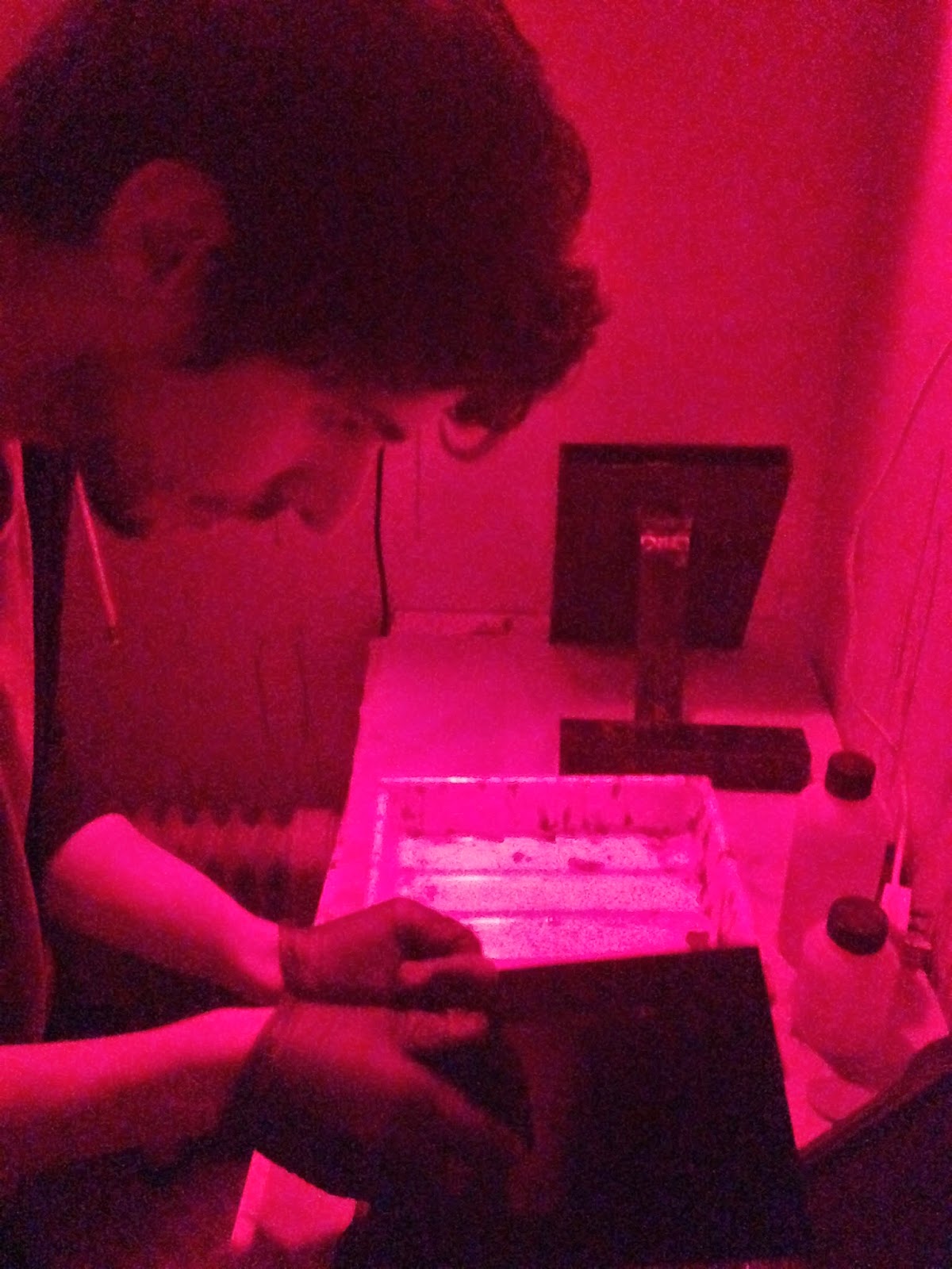
•    Black and white: I am a fan of black and white photography, and for this set of images I was thinking of working with black and white film, but to work with film is a longer procedure. I will try to manage my time to let more space for the darkroom procedure
I look forward to start this piece, but because of the lack of time I need to be quick and well organized to accomplish my tasks.
Bibliography:

Jill Freedman. (2014). Documenting the streets of New York City. Available: http://infocus.gettyimages.com/post/documenting-the-streets-of-new-york-city#.U3IVSFO1kfk. Last accessed 05th May 2014.
Valerio Polici. (2014). Railway Renegades. Available: http://www.newsweek.com/photo-essay-railway-renegades-230869. Last accessed 05 May 2014.

Unknown. (2014). Ergo Sum. Available: http://www.positive-magazine.com/photography/featured-story/ergo-sum/. Last accessed 05th May 2014.

Allen Frame. (2013). Mary Ellen Mark by Allen Frame. Available: http://bombmagazine.org/article/1213/mary-ellen-mark. Last accessed 10th May 2014.

Daniel Haim. (2013). Interview: Say What? Street Photographer Boogie Blows Our Minds.. Available: http://www.bloginity.com/2010/06/boogie-the-exclusive-interview-with-the-photographer/. Last accessed 10th May 2014.

Wednesday, 7 May 2014

Experiencing historical processes

When I talk about photography people always thinks about a digital camera, point and shoot cameras. But not many of the people knows different techniques and qualities. We all grew up in a digital era and we use digital cameras in daily basis, and we don't even recognise how flat and boring photography had became. In the early centuries of photography it wasn't so easy to make an image of someone. If we go back in history to around the 1870s, we will find photography more difficult to use. And that is what I really like about historical processes such as wet plate collodion, the intimacy and the fact that people don't even recognise these techniques.

So the origin of wet plate collodion goes back until the 1850s when the new technique has replaced the first photographic process called Daguerrotype. In the process we using collodion what has to be poured on a plate or glass, and handle it in a dark environment.

Bare in mind we using highly harmful and deadly chemicals!!! It is very important to know some health and safety issues. Because we work with glass and thin aluminium, these are sharp things and you can easily injure yourself. Collodion and Diethyl ether are colourless liquids and highly flammable. Cadmium bromide is extremely hazardous. It is a solid white to yellow crystalline. Acetic acid is a colourless liquid at room temp and it is dangerously corrosive. Ammonium iodide, white crystalline powder used in developer.

Recipe for collodion:
  • Ethyl alcohol 95-100%
  • Ethyl Ether
  • Cadmium Iodide
  • Cadmium Bromide
  • Nitrocellulose
  • Sulfuric acid
  • Silver Nitrate
  • Ferrous Nitrate
Dissolve the two above with 4 drops of water:
  • collodion: 118 ml
  • Ethyl Ether: 77ml
  • Ethyl Alcohol: 77ml
After we have been introduced to the chemicals, and the health and safety issues our "historical process" session has began.


Wet plate

Preparation:
If we using glass plate first we have to polish the surface to dissolve any grease and fingerprints to make sure the collodion will perfectly distributed on the plate. We used egg white to coat the edges of the plate this will help the collodion to stay on on the edges. After the plate has been polished and the egg white been applied on the edges, the collodion has to be treated in silver nitrate to make it photo sensitive. I have put the plate in the silver nitrate tank for 3 minutes. After this stage the process needs to be done in darkness, only the safe lights can be on. After 3 minutes our plate is ready to be taken out of the silver nitrate tank and to be placed in the film holder. We used half plate, so the size is smaller than 4x5". Now I have a loaded film holder and a light sensitive glass plate.


On the camera I've set up the distance, framing and the focus. The camera has to be focused on the eye because it is a portraiture and the dept of field is so shallow, anything outside of the focus plane will be blurred out. We set the lens for the widest aperture.

Taking the shot
After everything is done I just have to take the picture. I take the lens cap off release the flash and put the lens cap on. After all this, make sure the darkslide is back in its place, and head back to the darkroom. 

Developing and fixing
Open the film holder in complete darkness and then pour developer on the plate, leave it on for about 20 seconds meanwhile tilting the image to let the developer cover the whole image, and rinse the image. IMPORTANT to rinse the developed image with water if we use potassium cyanide. The acid releases gases from the cyanide and it is deadly. We all have to handle the chemicals with respect. The fixing procedure takes a couple of minutes. Usually it takes until the image clears and the milky Iodides wash off.

Wash the plate and leave it in the drier for a couple of minutes.

Here are the final images:


First attempt in wet plate collodion photography, the quality is satisfying for me, but keep on trying for a better result. I am fascinated by the resolution of the pictures, every little detail can be seen on the skin thanks for the UV light and the emulsion. The collodion exposes for the UV light which gets under the models skin.

Monday, 28 April 2014

Cyanotype - Digital negative

To produce a digital negative image for our upcoming Cyanotype event, I have picked a colour picture which I shot in Blackpool last summer.

First I opened is photoshop and duplicated the layer.


We need a contrasty black and white image so I turned the photograph into black and white by using the gradient map. The reason why we used this option is to keep the RGB and don't distort the colours by using the black and white option.


Then I changed the levels to make the image more saturated.


So now I have a contrasty black and white image, for printing it to a transparency film. But first I still have to adjust a few things.


To sharpen the image I used the High Pass option from the Filter -> Other menu. By using this we can lose detail so be careful with this filter.


I have changed the screen mode to overlay. So the background copy and the high pass filter now overlay.


I have to flatten the image than paint it blue with the paint bucket tool. Hot key "G". But first mix the colour for the cyanotype blue. We can do it via our colour panel. Double click on it and add Red 47 Green 161 and Blue 219.


 And use the screen mode and set it to overlay again. So the coloured image will look like this.


Wednesday, 2 April 2014

Creating my photo book and inspiration behind it

Photo book

To create a photo book. The basic idea behind the making of a good photo book is a sequence or series of photographs, what somehow share the same idea or similar inspiration. Like a portfolio, a good photo book should be consist of powerful images, but also there should be some "not so" powerful images to connect them together. The whole idea of a photo book is to tell a story, and create the feeling we are "reading" the pictures, like how we do it with a book. My photo book is not documentary style or story telling, but the images how I planned, share the same concept and inspired the same photographer.
One of my new photography projects is about composition. A simple black and white work, mainly inspired by Andre Kertesz. Photographing simple scenarios, street scenes or object what always in our sights but we don't really notice them. Placing them in a good composition to make it more exciting. Mainly using black and white because that's the way I see most of the times. So my first photo book would be about a selection of images, using space, compositions and blur.


My inspiration

Andre Kertesz (2.07.1984-28.09.1985) was a Hungarian-born photographer known for his groundbreaking contributions. In the early years of his career, his then-unorthodox camera angles and style prevented his work from gaining wider acknowledgment. Today he is considered one of the seminal figures of photojournalism. He started photographing in 1912, mainly people and the surrounding Hungarian plains. In the first world war he was photographing in the trenches, but most of his photographs were destroyed. Later he emigrated to France where he met other great photographers such as Henri-Cartier, Robert Capa, Man Ray, Brassai.

Kertesz's work is notable from his play with the shadows and distortions. Using a compact camera, rather than a large format, he was able to capture unique moments, like this. He was able to play with empty, creating more than exciting images.


Andre Kertesz is one of the biggest inspirations for this project. I was always fascinated how he was able to create some exciting images in a not so exciting everyday life's moment. One of the first photographs I've seen from Kertesz is called Meudon. I always train my skills to be able to compose something exciting like this image from him.


Without the elements, such as the moving train from right to left and the person in the middle who also walks left to right holding a frame, it would be just a simple picture. The funny thing is about Kertesz's work that is in his time -20s when this frame shot- the composition what he used was ground breaking and controversial.

Kertesz loved the play between pattern and deep space, the picture plane of his photographs is like a visual trampoline, taunt and hardy.


Another example for this original quality of formal invention, there is in the work of Kertesz another quality less easily analyzed, but surely no less important. It is a sense of the sweetness of life.


After I did some research and had a look at some of his works, I decided to create similar images. Using different equipment sometimes I used my iPhone because of its compact size, and also used film.

Andre Kertesz, Peter Adam (1985). Kertesz on Kertesz: A Self-Portrait. New York: Abbeville Press. 120.

Eric Kim. (2013, Sept 16). 10 Lessons Andre Kertesz has taught me.Available: http://erickimphotography.com/blog/2013/09/16/10-lessons-andre-kertesz-has-taught-me-about-street-photography/. Last accessed 20th March 2014.

My work


When I took this picture I was on my way home and cut my way through a car park and saw this odd object, in a parking slot. It was a little bit weird situation, what a shopping trolley would have been doing there. I saw a picture, a big negative space with an odd character the trolley and the brollie, but I also seen it in black and white. I had to convert the image to black and white, dodged and burnt a little bit over the asphalt and the little pond, because it was too bright.


This image has been taken during the time I was waiting for a tram to get to work. I saw a lot of people rushing to catch the train I took a couple of frames with my film camera using an xp2 film which is a c-41 black and white film. But I was using a not so slow shutter speed, I was thinking I will not be able to show the crowd and the movement on the pictures. I changed it to a slower shutter speed. Because of the image only existed in my head, I couldn't check it on the screen so I hoped for the best. At the end I would be able to catch what I was hoping for, I planned the lines will be able to lead the eyes towards the crowd and the slow shutter speed will bring some speed, energy to the image. But because it is a chromogenic film, the prints were a bit greenish toned. I have converted to black and white after I've scanned the negatives and brought out the blacks a little bit and the highlights.


The girl behind the shower screen. I wanted to create a moody vision, using the drops on the screen, the steam, what covers the body behind it, gives a mysterious feeling to the image. The model not being posed it was just a snapshot using my digital camera and in the post editing I just adjusted the black and whites, the levels and curves.


On this image I captured another vision of mine. The pedestrians way which creates a path from the darker area to the more lit area, creates a depressing feeling, similar to the days when it is raining in Manchester. I took this image with my iPhone using the hipstamatic application, which uses a square format.


I used the bicycle to fill the frame, to add more vertical lines to my composition. I burnt the pedestrian way to look not so bright. 

My iPhone is my gear again on this picture. The composition caught my eye, the lines and the doorway, also the two persons who are sitting under the cover of the gate. One of them moments what if I wouldn't have caught I would feel sorry about it for a long time.


So these would be my pictures for my first photo book. Let's do some research on the companies.

Research
I've been given a few tips what photo book companies I should have a look at first.

I had a look at dscolour labs' photo book editing site first, which would be a practical choice because it is close where I go to college so I could pick up the book in days. The range they offer looks all right but not so quality like what blurb offers.


Of this range I would have picked the Luxury Range. That looks good for me and the pricing is decent as well. 
Here we can see the pricing. 


But because this range only just arrived, it is still not available so I have to look for another solution.
Sadly I didn't find any reviews about their service, and seen their range I've decided not to go with their choice.

The ASDA supermarket offered possibilities aren't bad so I decided to have a look at their range as well. ASDA's range first looked quiet cheap-o so I decided not to carry on. The A3 sized photo book with hard cover priced for £55 what is not so bad for the quality.


The only problem is with ASDA photo book service is the poor rating on www.reviewcentre.com Only rated for 2.3 of 5.

For my black and white work I've planned a similar looking book for the finished work. But to not to decide to quick, let's have a look at Blurb.com

Blurb. This company is well known around the world, and very experienced in photo book making so firstly I would go for this one. It is a USA based company, and their costumer service is second to none. I have watched a couple of videos from Daniel Milnor who is a documentary photographer and works for Blurb Inc.


For self publishing your work it is the easiest way to get in and create something different. The range what Blurb offers is quite good, and the quality of the books look better than the other two companies offered. Pricing is similar, it only costs a couple of pounds more if I order it from Blurb. The book I selected is a large 13x11in landscape format one.


Here we can see the selected item. So I decided to carry on with the Blurb photo book.
The rating of the Blurb services is quite good overall, so I decided to choose their services for my first ever made photo book. Here is the review what I've found.


The making of the photo book
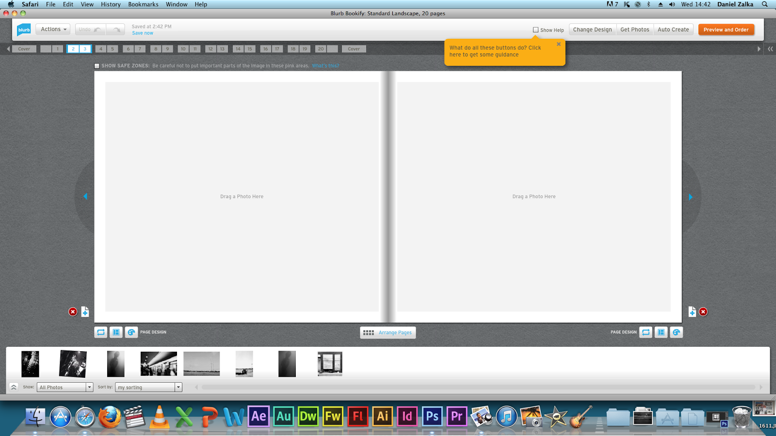
To make our photo book on blurb we've got to open our account. If we haven't got one, we will have to register quickly with them. I have signed in to my account and started it, with their on-line program called bookify.

You can use light room or indesign

I chose the large landscape format
Classic white background for the black and white prints

So I have edited the photos for blurb printing. So I decided to go with the 20x25cm landscape photo book. Photos being edited for 300ppi and 20cm height or 25cm width.


Using Bookify
Using the on-line program to create the Blurb book is just simple. It is so easy to see through and organise your photos, with a few pictures like mine it took me about half an hour to make it, including the image editing time.

Here are some screenshots about the procedure.
Started with the layout. Easy to see through

Starting with a simple image.

A stronger image no captions just plain photography

Easy to see through layout.
Digital magazine
We have also discovered an easy way of self publishing, through a digital magazine called issuu. By registering and creating your own pages, we can also publish our work, and follow others. This is the easisest way of self-publishing.

First is to create a .pdf file or a .doc file to be able to upload the ready works.  Here I just opened word and I have inserted all my photos.


After all this I just have to upload everything to Issuu, using their own program which we can find on the website itself.


It will take a few minutes to convert it.


We can edit a little bit, adding a title and the page layout etc...


Now I can publish our final work, my first issuu magazine.


Conclusion
In the beginning of this project I thought it is not going to be easy, and I was right. To choose my own pictures to create my own photo book, is something unique feeling what worth the struggle. It is very important to do a decent research on photo books because nobody wants to order a bad quality book for this much money. Books always been important for me, I own a lot of books. I appreciate them more than internet browsers. Easier to find everything just to type in google, but a book is physical and limited. That's the magic of a book I think. I will create more photo books if my time will let me do more projects.


Bibliography: