To produce a digital negative image for our upcoming Cyanotype event, I have picked a colour picture which I shot in Blackpool last summer.
First I opened is photoshop and duplicated the layer.
We need a contrasty black and white image so I turned the photograph into black and white by using the gradient map. The reason why we used this option is to keep the RGB and don't distort the colours by using the black and white option.
Then I changed the levels to make the image more saturated.
So now I have a contrasty black and white image, for printing it to a transparency film. But first I still have to adjust a few things.
To sharpen the image I used the High Pass option from the Filter -> Other menu. By using this we can lose detail so be careful with this filter.
I have changed the screen mode to overlay. So the background copy and the high pass filter now overlay.
I have to flatten the image than paint it blue with the paint bucket tool. Hot key "G". But first mix the colour for the cyanotype blue. We can do it via our colour panel. Double click on it and add Red 47 Green 161 and Blue 219.
And use the screen mode and set it to overlay again. So the coloured image will look like this.
To create a photo book. The basic idea behind the making of a good photo book is a sequence or series of photographs, what somehow share the same idea or similar inspiration. Like a portfolio, a good photo book should be consist of powerful images, but also there should be some "not so" powerful images to connect them together. The whole idea of a photo book is to tell a story, and create the feeling we are "reading" the pictures, like how we do it with a book. My photo book is not documentary style or story telling, but the images how I planned, share the same concept and inspired the same photographer.
One of my new photography projects is about composition. A simple black and white work, mainly inspired by Andre Kertesz. Photographing simple scenarios, street scenes or object what always in our sights but we don't really notice them. Placing them in a good composition to make it more exciting. Mainly using black and white because that's the way I see most of the times. So my first photo book would be about a selection of images, using space, compositions and blur.
My inspiration
Andre Kertesz (2.07.1984-28.09.1985) was a Hungarian-born photographer known for his groundbreaking contributions. In the early years of his career, his then-unorthodox camera angles and style prevented his work from gaining wider acknowledgment. Today he is considered one of the seminal figures of photojournalism. He started photographing in 1912, mainly people and the surrounding Hungarian plains. In the first world war he was photographing in the trenches, but most of his photographs were destroyed. Later he emigrated to France where he met other great photographers such as Henri-Cartier, Robert Capa, Man Ray, Brassai.
Kertesz's work is notable from his play with the shadows and distortions. Using a compact camera, rather than a large format, he was able to capture unique moments, like this. He was able to play with empty, creating more than exciting images.
Andre Kertesz is one of the biggest inspirations for this project. I was always fascinated how he was able to create some exciting images in a not so exciting everyday life's moment. One of the first photographs I've seen from Kertesz is called Meudon. I always train my skills to be able to compose something exciting like this image from him.
Without the elements, such as the moving train from right to left and the person in the middle who also walks left to right holding a frame, it would be just a simple picture. The funny thing is about Kertesz's work that is in his time -20s when this frame shot- the composition what he used was ground breaking and controversial.
Kertesz loved the play between pattern and deep space, the picture plane of his photographs is like a visual trampoline, taunt and hardy.
Another example for this original quality of formal invention, there is in the work of Kertesz another quality less easily analyzed, but surely no less important. It is a sense of the sweetness of life.
After I did some research and had a look at some of his works, I decided to create similar images. Using different equipment sometimes I used my iPhone because of its compact size, and also used film.
Andre Kertesz, Peter Adam (1985). Kertesz on Kertesz: A Self-Portrait. New York: Abbeville Press. 120.
Eric Kim. (2013, Sept 16). 10 Lessons Andre Kertesz has taught me.Available: http://erickimphotography.com/blog/2013/09/16/10-lessons-andre-kertesz-has-taught-me-about-street-photography/. Last accessed 20th March 2014.
My work
When I took this picture I was on my way home and cut my way through a car park and saw this odd object, in a parking slot. It was a little bit weird situation, what a shopping trolley would have been doing there. I saw a picture, a big negative space with an odd character the trolley and the brollie, but I also seen it in black and white. I had to convert the image to black and white, dodged and burnt a little bit over the asphalt and the little pond, because it was too bright.
This image has been taken during the time I was waiting for a tram to get to work. I saw a lot of people rushing to catch the train I took a couple of frames with my film camera using an xp2 film which is a c-41 black and white film. But I was using a not so slow shutter speed, I was thinking I will not be able to show the crowd and the movement on the pictures. I changed it to a slower shutter speed. Because of the image only existed in my head, I couldn't check it on the screen so I hoped for the best. At the end I would be able to catch what I was hoping for, I planned the lines will be able to lead the eyes towards the crowd and the slow shutter speed will bring some speed, energy to the image. But because it is a chromogenic film, the prints were a bit greenish toned. I have converted to black and white after I've scanned the negatives and brought out the blacks a little bit and the highlights.
The girl behind the shower screen. I wanted to create a moody vision, using the drops on the screen, the steam, what covers the body behind it, gives a mysterious feeling to the image. The model not being posed it was just a snapshot using my digital camera and in the post editing I just adjusted the black and whites, the levels and curves.
On this image I captured another vision of mine. The pedestrians way which creates a path from the darker area to the more lit area, creates a depressing feeling, similar to the days when it is raining in Manchester. I took this image with my iPhone using the hipstamatic application, which uses a square format.
I used the bicycle to fill the frame, to add more vertical lines to my composition. I burnt the pedestrian way to look not so bright.
My iPhone is my gear again on this picture. The composition caught my eye, the lines and the doorway, also the two persons who are sitting under the cover of the gate. One of them moments what if I wouldn't have caught I would feel sorry about it for a long time.
So these would be my pictures for my first photo book. Let's do some research on the companies.
Research
I've been given a few tips what photo book companies I should have a look at first.
I had a look at dscolour labs' photo book editing site first, which would be a practical choice because it is close where I go to college so I could pick up the book in days. The range they offer looks all right but not so quality like what blurb offers.
Of this range I would have picked the Luxury Range. That looks good for me and the pricing is decent as well.
Here we can see the pricing.
But because this range only just arrived, it is still not available so I have to look for another solution.
Sadly I didn't find any reviews about their service, and seen their range I've decided not to go with their choice.
The ASDA supermarket offered possibilities aren't bad so I decided to have a look at their range as well. ASDA's range first looked quiet cheap-o so I decided not to carry on. The A3 sized photo book with hard cover priced for £55 what is not so bad for the quality.
The only problem is with ASDA photo book service is the poor rating on www.reviewcentre.com Only rated for 2.3 of 5.
For my black and white work I've planned a similar looking book for the finished work. But to not to decide to quick, let's have a look at Blurb.com
Blurb. This company is well known around the world, and very experienced in photo book making so firstly I would go for this one. It is a USA based company, and their costumer service is second to none. I have watched a couple of videos from Daniel Milnor who is a documentary photographer and works for Blurb Inc.
For self publishing your work it is the easiest way to get in and create something different. The range what Blurb offers is quite good, and the quality of the books look better than the other two companies offered. Pricing is similar, it only costs a couple of pounds more if I order it from Blurb. The book I selected is a large 13x11in landscape format one.
Here we can see the selected item. So I decided to carry on with the Blurb photo book.
The rating of the Blurb services is quite good overall, so I decided to choose their services for my first ever made photo book. Here is the review what I've found.
The making of the photo book
To make our photo book on blurb we've got to open our account. If we haven't got one, we will have to register quickly with them. I have signed in to my account and started it, with their on-line program called bookify.
You can use light room or indesign
I chose the large landscape format
Classic white background for the black and white prints
So I have edited the photos for blurb printing. So I decided to go with the 20x25cm landscape photo book. Photos being edited for 300ppi and 20cm height or 25cm width.
Using Bookify
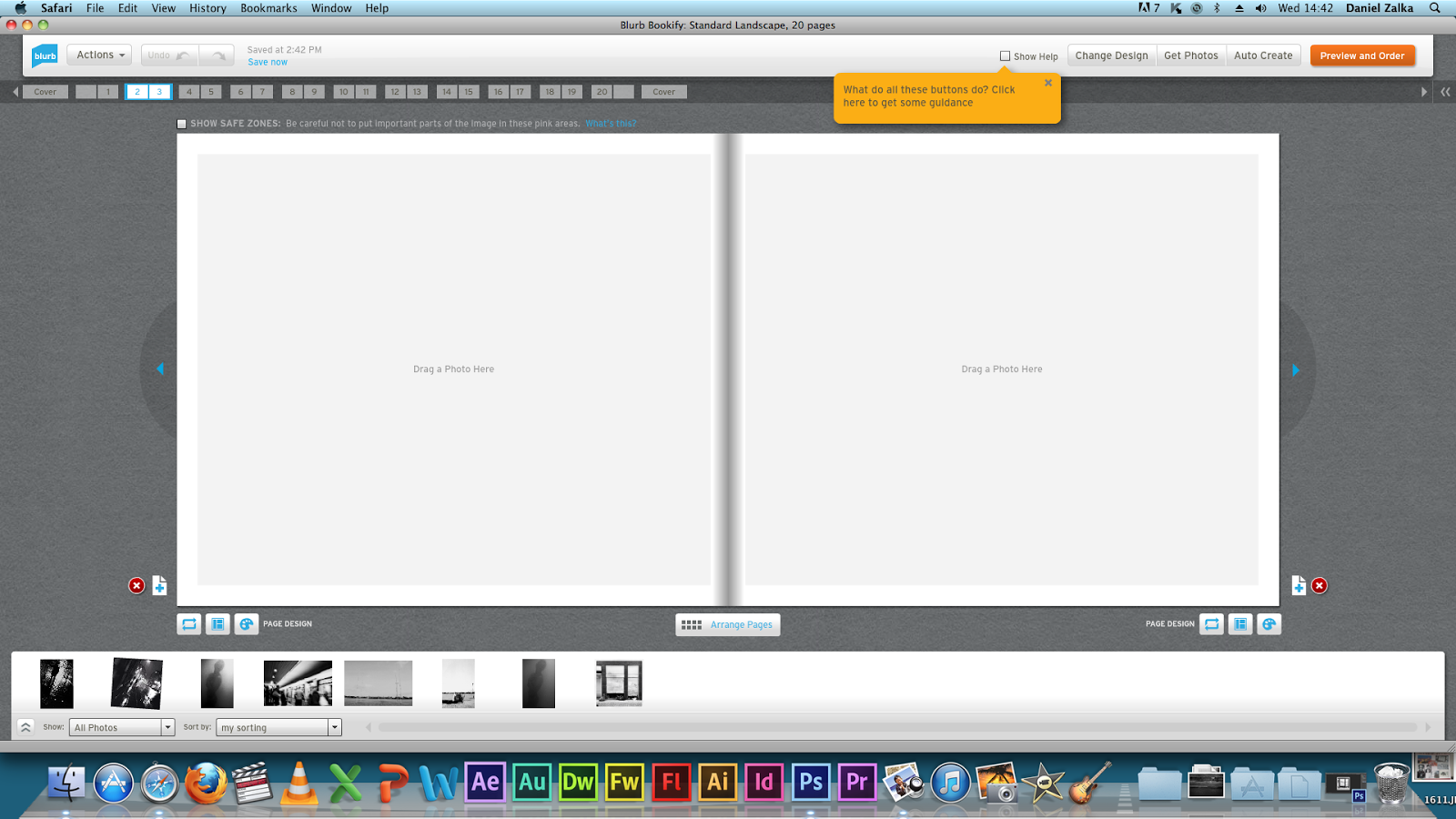
Using the on-line program to create the Blurb book is just simple. It is so easy to see through and organise your photos, with a few pictures like mine it took me about half an hour to make it, including the image editing time.
Here are some screenshots about the procedure.
Started with the layout. Easy to see through
Starting with a simple image.
A stronger image no captions just plain photography
Easy to see through layout.
Digital magazine
We have also discovered an easy way of self publishing, through a digital magazine called issuu. By registering and creating your own pages, we can also publish our work, and follow others. This is the easisest way of self-publishing.
First is to create a .pdf file or a .doc file to be able to upload the ready works. Here I just opened word and I have inserted all my photos.
After all this I just have to upload everything to Issuu, using their own program which we can find on the website itself.
It will take a few minutes to convert it.
We can edit a little bit, adding a title and the page layout etc...
Now I can publish our final work, my first issuu magazine.
Conclusion
In the beginning of this project I thought it is not going to be easy, and I was right. To choose my own pictures to create my own photo book, is something unique feeling what worth the struggle. It is very important to do a decent research on photo books because nobody wants to order a bad quality book for this much money. Books always been important for me, I own a lot of books. I appreciate them more than internet browsers. Easier to find everything just to type in google, but a book is physical and limited. That's the magic of a book I think. I will create more photo books if my time will let me do more projects.